What Americans Think About Climate Change in Seven Maps
Researchers publish a new mapping tool that estimates county-level public opinion.
Eric Roston, Bloomberg
April 07, 2015
Researchers at Yale have unveiled a new interactive map that estimates public opinion on global warming right down to the county level.
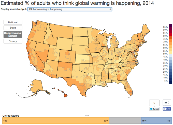
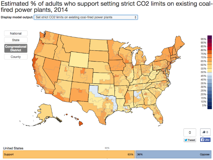
As a nation, 63 percent of Americans believe that the globe is warming. (Note: It is.) But that single statistic reveals little about what people in different states, local communities, and congressional districts think. The research, which was published today in the journal Nature Climate Change, makes estimates for those geographies and asks:
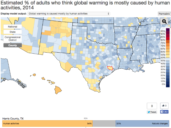
- Whether people believe humans are causing most of the warming (Note: They are.)
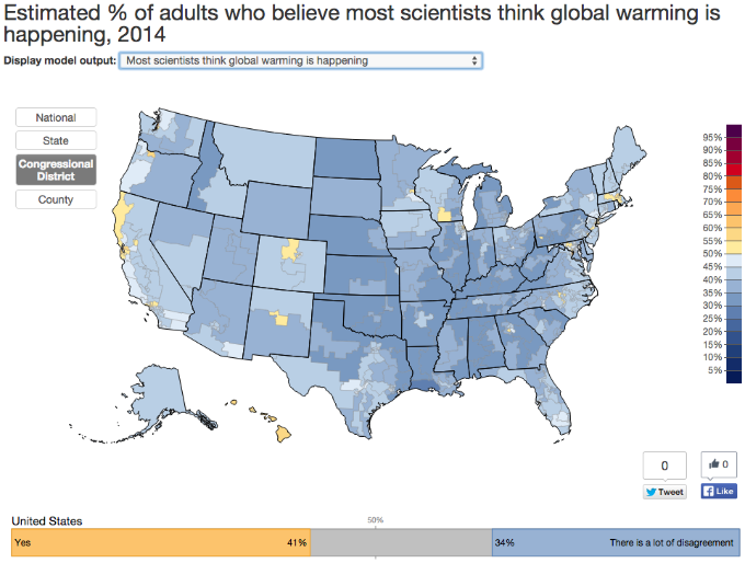
- If people are aware that scientists understand the world is warming.
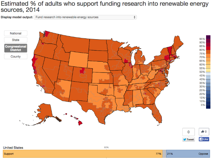
- What implications of the warming may be: Are people afraid? For themselves? For people in developing countries? For the future? Should we fund renewables, regulate carbon, or do something else?
The research is primarily based on data from 12 surveys conducted between 2008 and 2013 by the Yale Project on Climate Communication and the George Mason Center for Climate Change Communication. The results were analyzed using a relatively new statistical technique developed by political scientists that allowed the team to project public opinion on climate change from demographic and geographic data. The results were then compared with independent state and local surveys to make sure they held up.
The map built by the Yale center is accessible to the public, and it may be useful to anyone from government managers who work on climate adaptation, to political campaigners, even to businesses selling climate-friendly products. "I could foresee some commercial purposes," said Anthony Leiserowitz, director of the Yale center. "That's not why we did this."
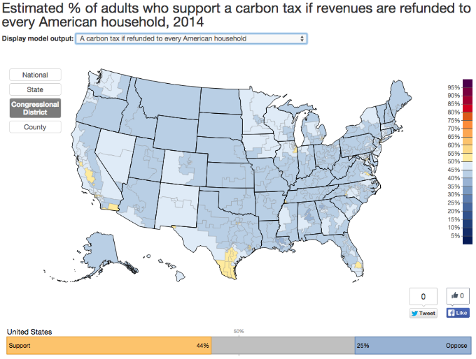
Below are seven maps, each of which looks at how estimates of U.S. public opinion change in response to various climate-related questions and is organised by congressional district.
Americans understand that the world is warming. Virtually every district is tan — which represents 50 percent of public opinion — or a darker shade of orange or red:

![]() © Copyright 1999-2015 RenewableEnergyWorld.com - All rights reserved.
http://www.renewableenergyworld.com
© Copyright 1999-2015 RenewableEnergyWorld.com - All rights reserved.
http://www.renewableenergyworld.com